 Note
Note
In many ways, designing for the Apple Watch can feel easier: the screen is smaller, its always in Dark Mode, there are fewer controls to choose from...
Yet, to me, to design for the Apple Watch (or to design watchOS itself as our friends at Apple do) is to join a design practice steeped in challenge. Everywhere the iPhone can show you the largest form of an element, like a Navigation Bar, the Watch must do it many times smaller. Everywhere the iPhone can show you beautiful content, the Watch must do it by showing you less.
Thinking about how much effort has gone into figuring out the design of watchOS, I'm reminded of those streets, ones you may have in your own neighborhood, where there is a sign that says "NOT A THROUGH STREET" or "DEAD END" at the entrance. It's true, you can't always know whether a street is a through street by looking at its entrance, but for some funny reason I feel like there should be a way for us to know—like we shouldn't need a sign for it.
People who use our designs feel this way turned up to a hundred. They can't know where tapping a button will take them, whether they'll go to a dead end or to another intersection of paths. The Apple Watch is taking on this challenge, making apps easy to navigate so that people don't end up getting stuck, and it's doing it all on a tiny screen. It's incredible to me and a huge triumph of design.
This week, we're taking a look at the wonderful new strides in Apple Watch design that Apple debuted at WWDC23. I hope you find something here that you can mix into your own design work. Thank you for reading UI Designer Weekly. —S
This issue continues my WWDC23 coverage and discusses iOS. In upcoming week, we'll look at one more platform: tvOS.
New Standards
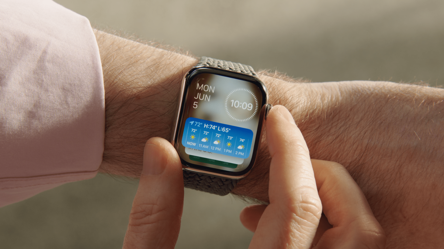
Works on Every Face
The new Smart Stack on watchOS 10 lets you turn the Digital Crown on any watch face to reveal widgets. Before watchOS 10, you'd have to select a certain watch face if you wanted room for a large widget. Now, you can use any watch face you like and have quick access to gorgeous full-color widgets. This is a great example of improving on a design to lift restrictions that people might have wondered about and never fully understood.
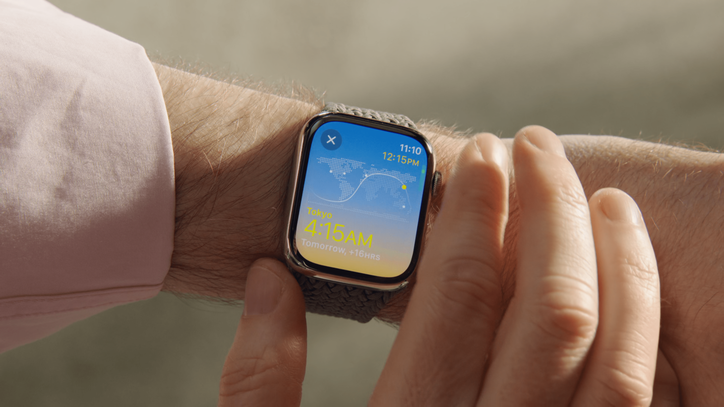
Take It Corner-to-Corner
A new design language in watchOS 10 emphasizes the corners of the Watch's display, recommending new styles that include corner buttons like this view of Weather. Many apps in the watchOS section of the Keynote and on the new watchOS 10 web page take advantage of this new style to enable faster switching between sections and simpler navigation back from detail pages.
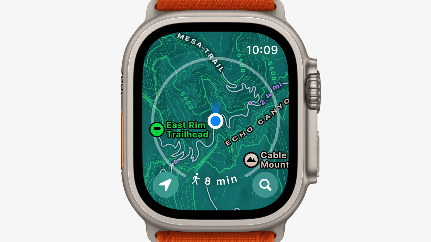
In My Zone
Maps on watchOS 10 with a gorgeous new interface. Buttons in the corners follow the new style and a ring illustrates walking distance and time without getting in the way. I'm struck by the edge-to-edge map and the perfect vibrancy and feel of the corner buttons. There are a lot of contrast tricks at play here. "East Rim Trailhead" has a thick dark border about it to keep it legible and the 10:09 time has a subtle blur under it that's hardly noticeable until you zoom.
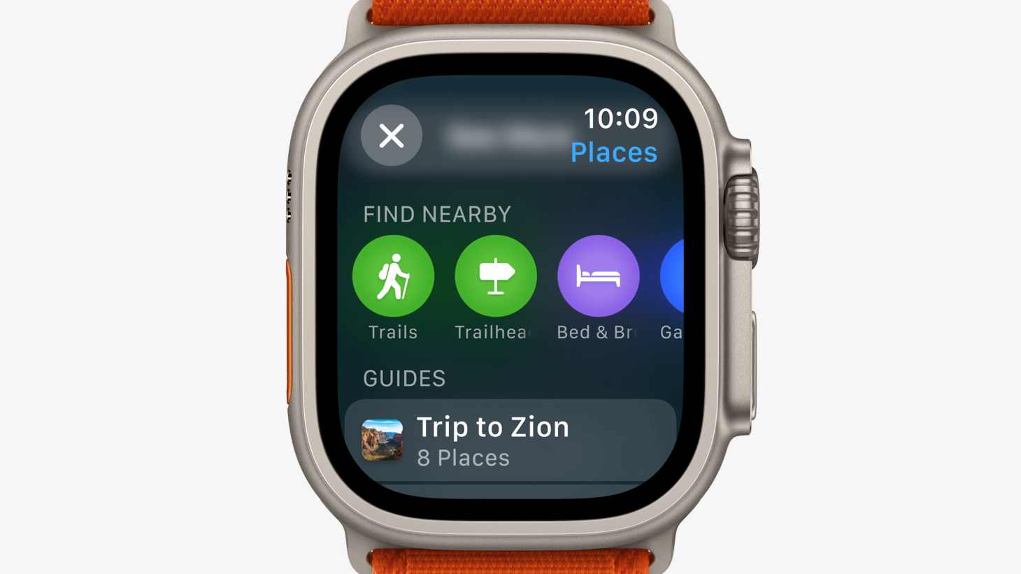
Try Something New
Maps on watchOS 10 shows a navigation bar title for the first time on an English-language device on the right side of the screen under the time. This helps the new watchOS 10 style work, creating room for a corner button in the top left. I think this is a great reminder that we can rethink even the most basic elements of our designs to allow new ideas to come through.
Arrange the Shades
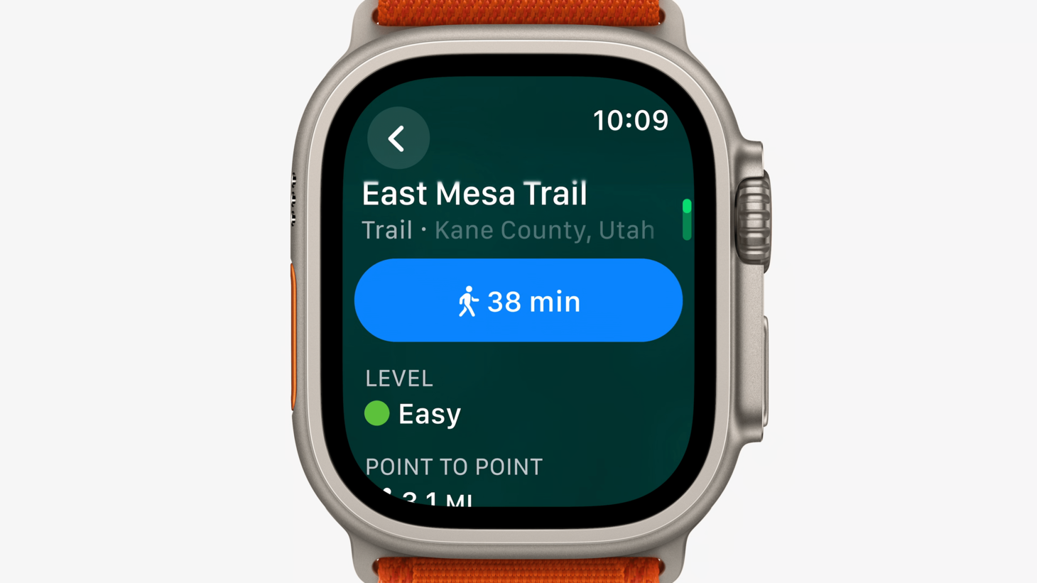
A wonderful demonstration of color, contrast, and size. The vertical and horizontal arrangement of "East Mesa Trail", "Trail", and "Kane County, Utah" give us a great reference for displaying information with three elements.