 Note
Note
I've previously written about the challenge of designing for iPadOS. Ideas, though they may fill a small portrait rectangle with ease, are much harder to persuade to fill a larger multi-column landscape rectangle. The iPad has space for your design, your content, and your controls, and more.
Apple's announcement of iPadOS 17 gives us our annual info packet filled with design samples, updated references, new rules, and new recommendations. An iPad is a MacBook without a keyboard. An iPad is a large iPhone. An iPad is a tablet.
The design of iPadOS follows its multitalented adventurous home in being many different things. Let's take a look at a few details that stood out to me in the announcement of iPadOS 17 to see what we can learn.
I hope you find something here that you can mix into your own design work. Thank you for reading UI Designer Weekly. —S
This issue continues my WWDC23 coverage and discusses iOS. In upcoming weeks, we'll look at the other platforms. Here's the schedule:
Next: watchOS
Finally: tvOS
New Standards
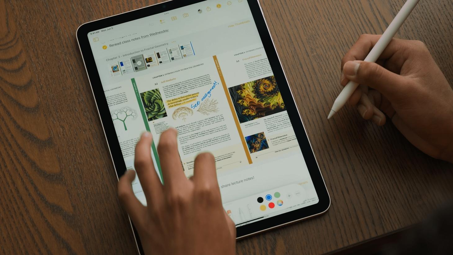
I Prefer a Drawer
Notes on iPadOS 17 gains the peculiarly-delightful ability to show a horizontal drawer of page thumbnails for a PDF you've added to your note. If you zoom in to the corner, you'll see there's a button to hide the thumbnails. This positioning on the top and as a horizontal scroll is nice in itself and it supports the edge-to-edge PDF page swipes that are happening below (by staying out of their way).
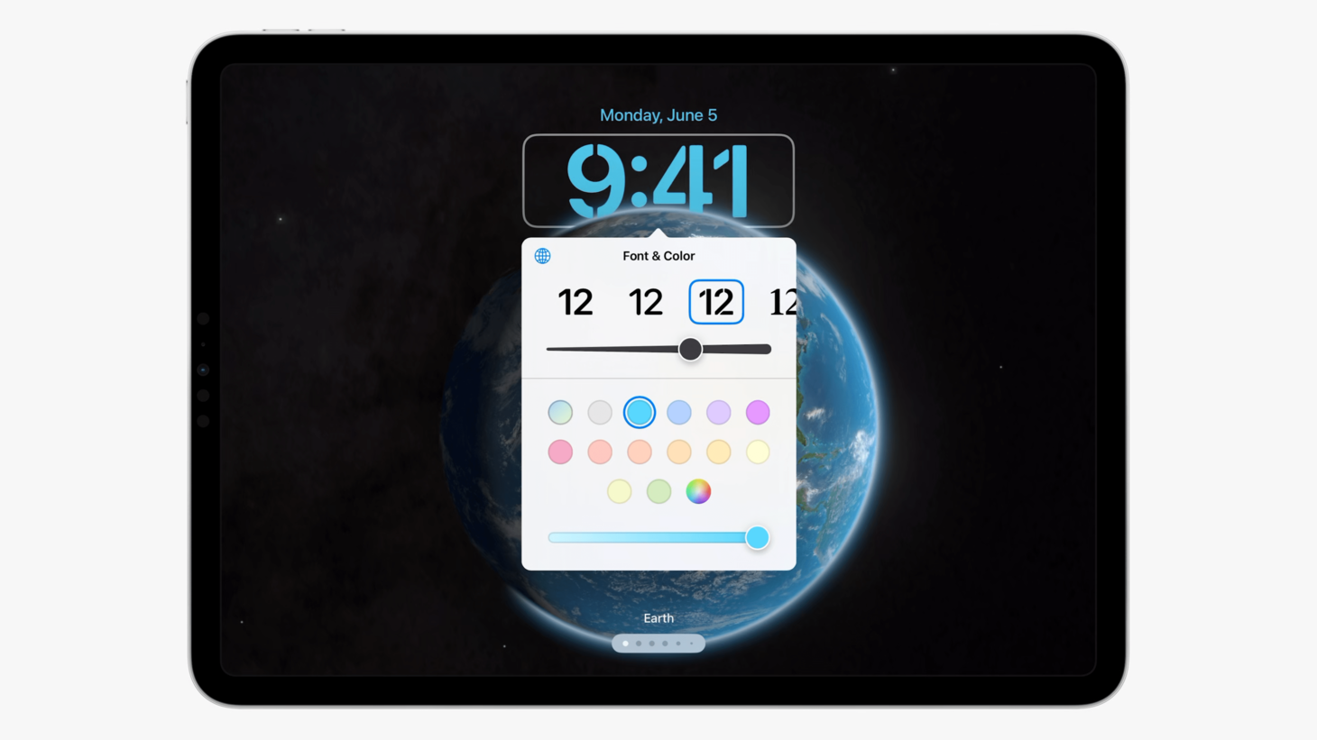
It's Presented Above Directly
A lot of things on iPadOS appear in the form of popovers and this popover in the new Lock Screen customization area is a wonderful new example. There are no section titles, only a combined "Font & Color" title at the top. One of the hardest-working interface elements we live with has to be that little point on the presenting side of the popover. There's something to the center justification of the color swatches. I think this is a great example of the role "small" interfaces play on the iPad's larger display.
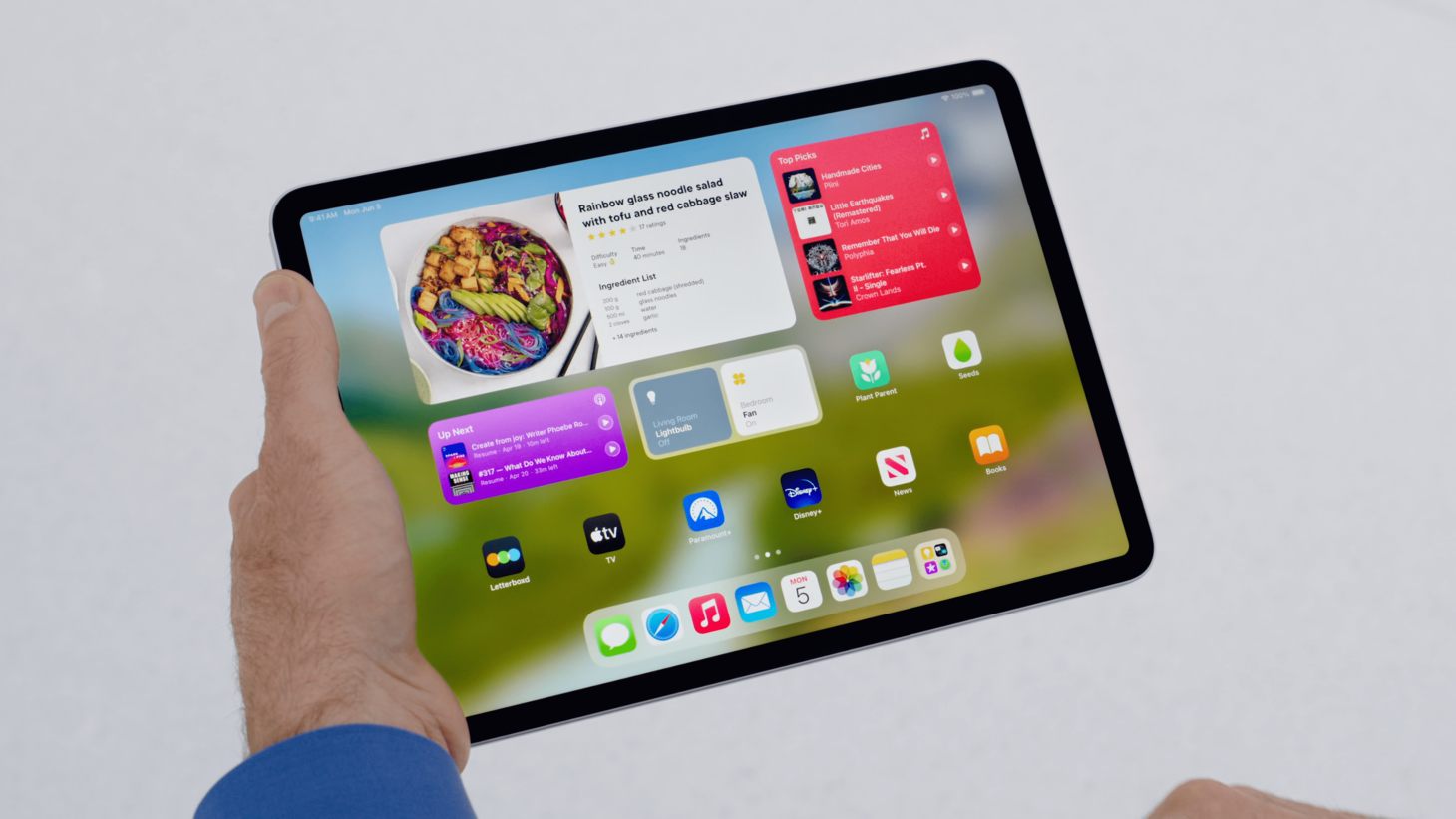
Into Places All Day
iPadOS 17 has brought a new dimension to the home screen with interactive widgets and their tappable, actionable buttons. Widgets now display constant reminders of what makes something look tappable and what makes something look not. This feature may just be a fantastic reminder for us about the "loop" of interactivity, where people see things change when they take an action, because each of these interactive widgets update live when their buttons are pressed. This is a wonderful update for the once-static home screen and a confident extension of the Widgets design language.
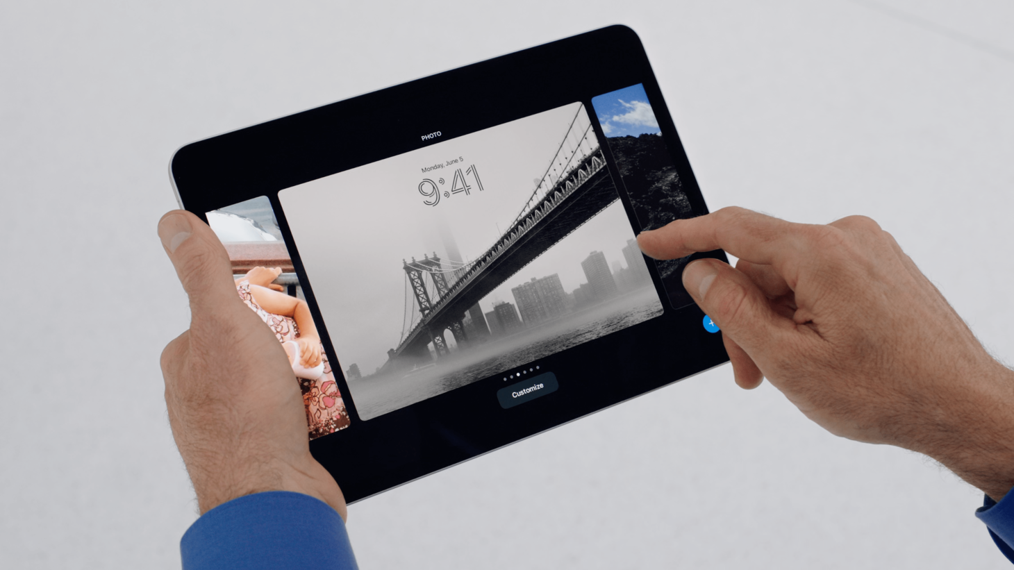
Interfaces Paired Along Dimensions
Lock Screens on iPadOS 17 give us a wonderful reminder to use the same shapes in our designs, even at different parts of the experience. If Lock Screens look a certain way, why not let them be edited while they look that same way? If you can see your changes live, you can be confident in each change. I'm aware this may feel like a basic observation, but applied to our own designs, there may be plenty of places where designs show something one way and edit them another. iPadOS 17 here gives us a wonderful reference of ways to navigate that.
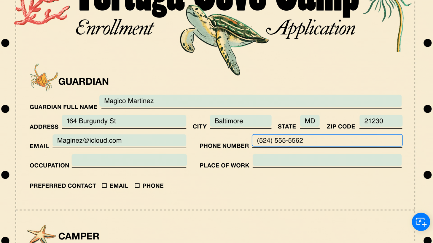
Innocently Placing a Dropzone
I was struck by the simplicity of AutoFill's presentation on iPadOS 17. Where intended-but-not-digitized fields are detected, a light blue lightly-rounded rectangle is placed. This feels to me like the right balance of easy to see but also easy to ignore. And again, as we discuss so often, that is all it takes. There aren't more decorations or more embellishments—just the shape. Makes me want to look at my designs to find places where I'm doing too much and a simpler shape would do the job.