 Note
Note
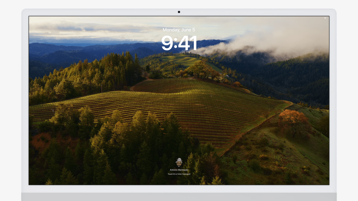
This week, we're looking at the coolest new designs that were announced with macOS Sonoma at WWDC23. macOS Sonoma may seem lighter on the scale when it comes to design changes, but there's actually quite a few additions that are on some big-name spots: the Lock Screen, the desktop, and something that I haven't mentioned in this issue but aerial screen savers (finally!). Did you see that they actually move slowly and then come to a stop when you unlock on your Mac, and wherever they stop, that's where your desktop is?
I hope you find something here that you can mix into your own design work. Thank you for reading UI Designer Weekly. —S
This issue continues my WWDC23 coverage and discusses iOS. In upcoming weeks, we'll look at the other platforms. Here's the schedule:
July 7th: iPadOS
July 14th: watchOS
July 21st: tvOS
New Standards

A Familiar Face
The new Lock Screen on macOS Sonoma continues the transfer process we saw last year with System Preferences becoming System Settings. This is perhaps a great reminder for us to look at our designs and ask ourselves if any parts look a certain way not because they should, but because they have in the past. I can imagine people opening their MacBook for the first time and instantly feeling comfortable, knowing well where they are.

Paying Attention to Attention
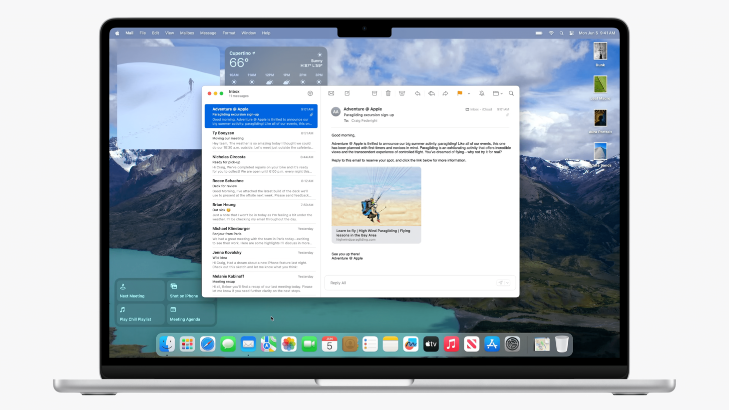
Widgets placed onto the desktop in macOS Sonoma play a wonderful trick to become less distracting when desired. When you start working with an application, widgets on the desktop fade and blend into your desktop wallpaper. I think this is a great example of how we can think hard about what our designs need and get creative. It's an advanced thought that maybe if the widgets were to fade and blend, they'd be easier to ignore and yet still easy to see. Color, depth, interactivity, affordances, all at play. We can put this kind of thinking into our own complex situations.

You Could Think Conventionally Unconventionally
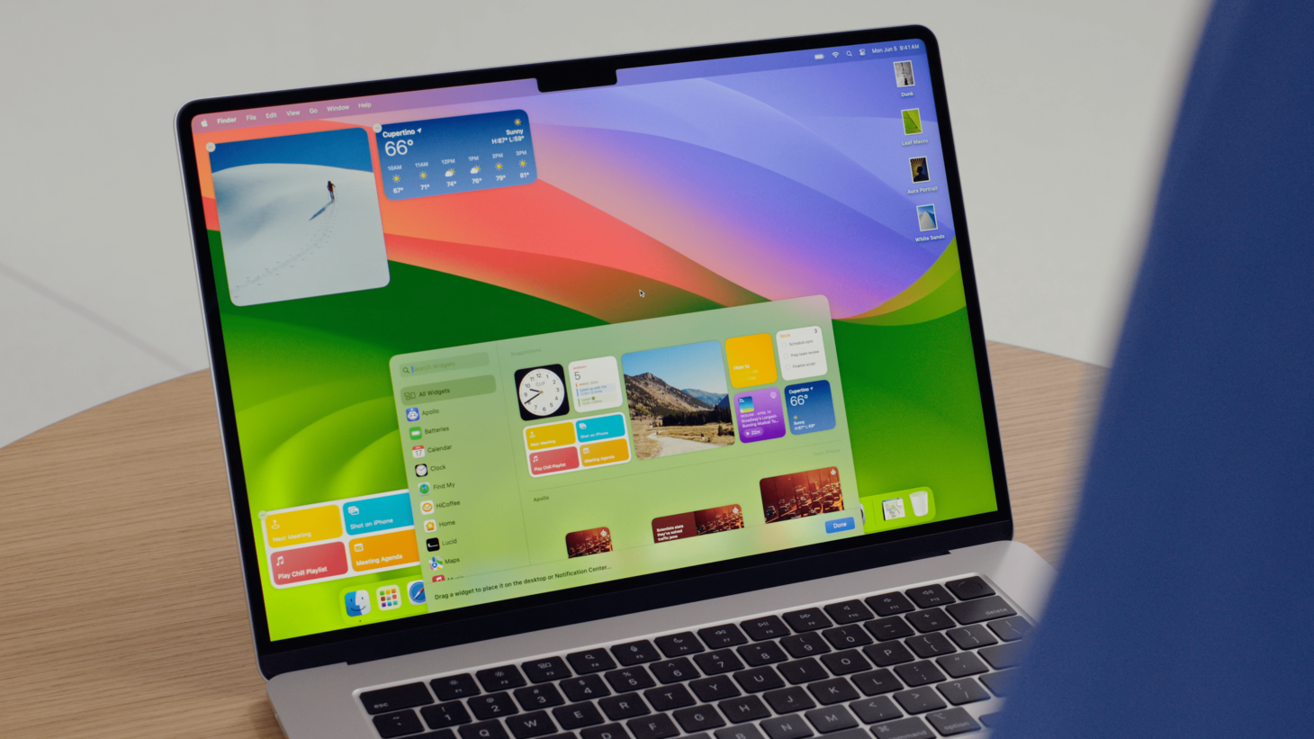
Widgets on macOS Sonoma are added to the desktop from a drawer of widgets that looks like the one on iOS and iPadOS. This strikes me as interesting because the macOS design language has plenty of possible ways to represent this sort of design, whether you'd call it a "temporary window" or a "picker panel" or a "drag-and-drop zone". But, even though those options exist, we see this drawer designed in a way that more closely mirrors widgets where they are at home: on iOS and iPadOS. I think this is a great reminder that it's okay for us to use something other than what the defaults are on a given platform when we may see great familiarity and usability benefits as a result. Maybe the fact that this design is so uncommon on macOS to this point actually helps it feel even more transient.

There's a State for That
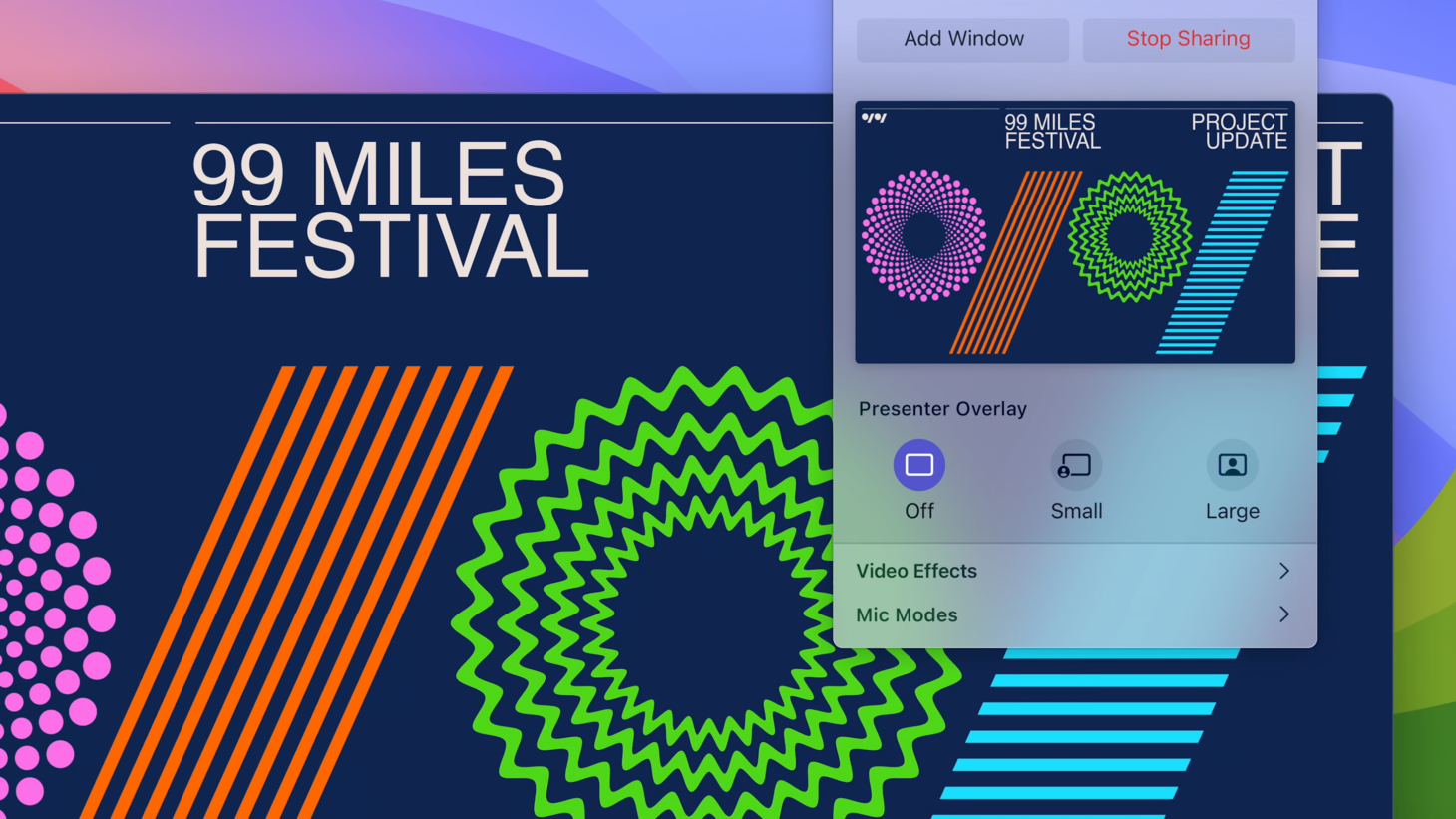
Screen Sharing on macOS Sonoma has a new feature called Presenter Overlay that lets you put yourself over your shared window picture-in-picture style. There's a great example in here of designing for an "off" state: the first button on the left permanently says "Off" and is highlighted when there is no overlay. We might not always have room in our designs to have a special button or toggle just for the "Off" state, but with activities and actions that are more complex, perhaps we can provide that extra bit of clarification.