 Note
Note
Welcome back!
Hello and welcome back to another issue of UI Designer Weekly. This week, we've got something of a hodgepodge of designs to look at.
As always, I hope you find something here that inspires you that you can mix into your own work. Thank you for reading and thank you for all the new subscribers.
New Standards
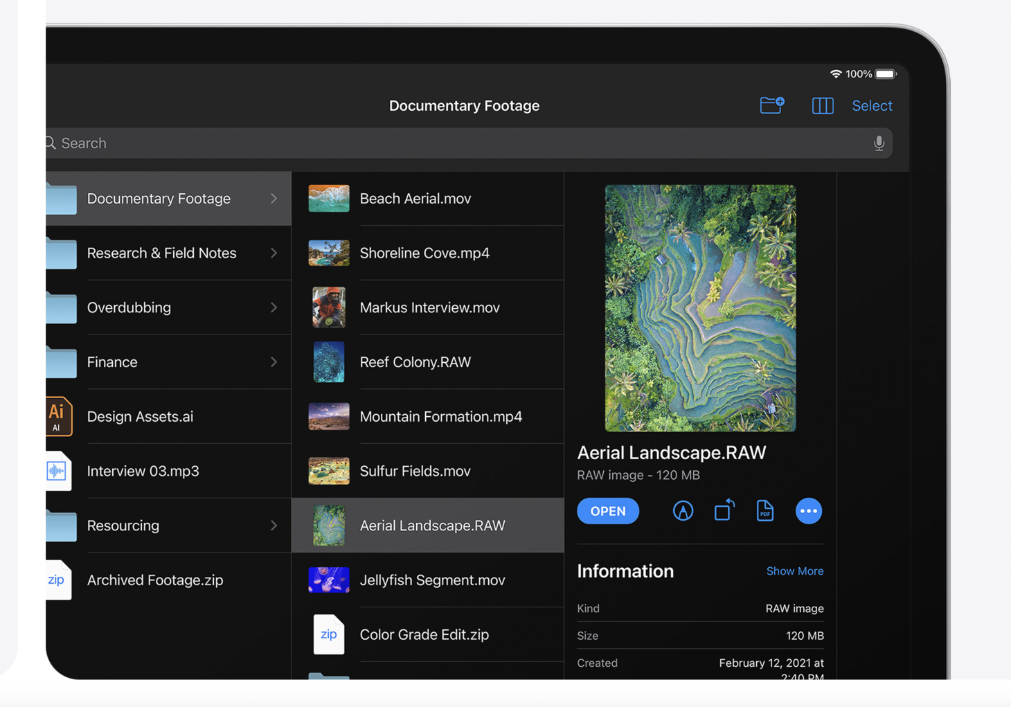
Finder, Elevated
Exploring folders in Files on iPadOS 14. Between each column there is only a thin line and on the right there is a spacious Quick Look area. This is a great example of establishing hierarchy with size, placement, and form. The image thumbnail is really big so it stands out as being the current selection. The title is in a beautiful primary font size and color, placed over the metadata of "RAW image • 120MB" which itself is a great example of of making important information clear without any extra ceremony—the file type ("RAW image") and the file size ("120MB") are simply placed together in a row. There are beautiful relationships all over this screen, but perhaps the next best example to learn from is the Open button and the other action buttons to the right of it. The Open button feels prominent and like the main action, and the other actions feel useful, immediate, and yet the buttons that are secondary to Open by being smaller and outlined instead of filled.
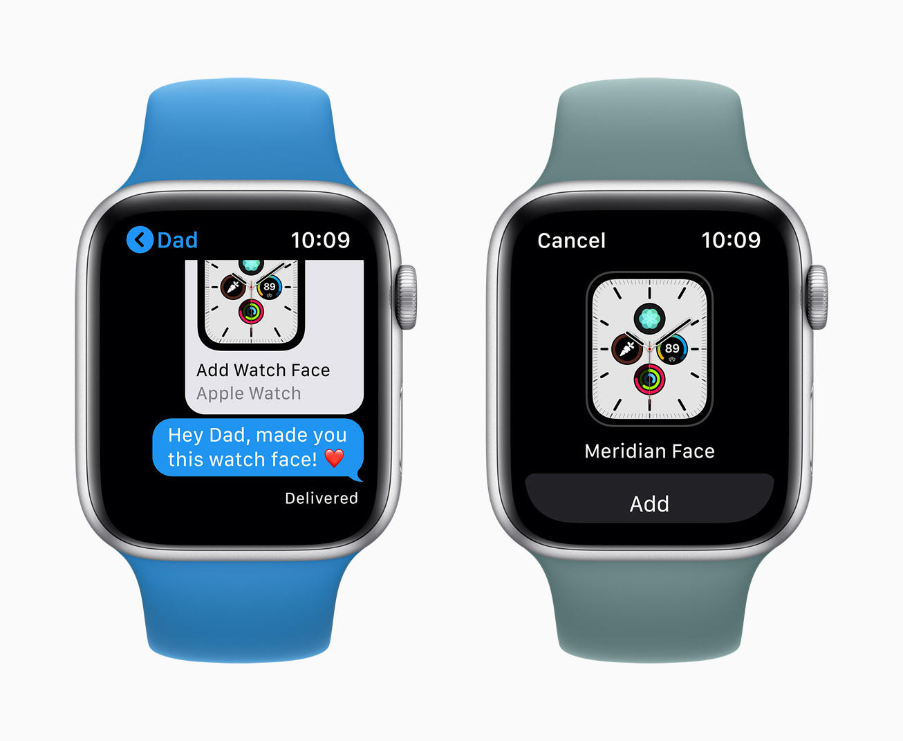
New Interactions Made Familiar
A large, single element button for Face Sharing on watchOS 7. Tapping it shows a centered view of the face with a single Add button. This is perhaps a great reminder that if we are creating a product that does something new that our people might not have done before, like sharing one of their Apple Watch faces with another person, the interface that we design for that action shouldn't have many surprises along the way. Maybe even, the less surprises it has along the way, the easier it'll be for people to do this new thing.
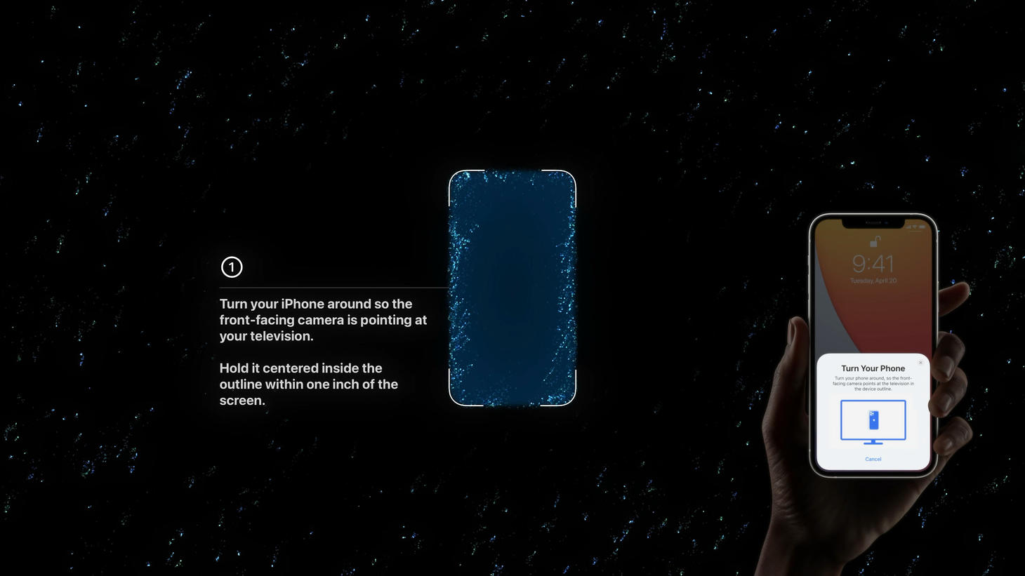
A Step-by-Step, Simple and Lively
Step one of the color balancing process illustrated with text, imagery, and effects on TV 4K. This is perhaps a great example that we can use a couple of sentences for explanation if our products are asking people to do something that's out of the ordinary that they don't have to do often. The nice "1" in the circle on the left and the hand holding the real iPhone on the right create great space for the blue area in the center. Once people begin the process, the "1" changes as each step completes and the text below changes to a single progress circle filling up. This is another great example of keeping the main points of the interface consistent—as the color balancing process begins, rather than the whole thing rearranging, it's only key, prominent details that go in and out and update.
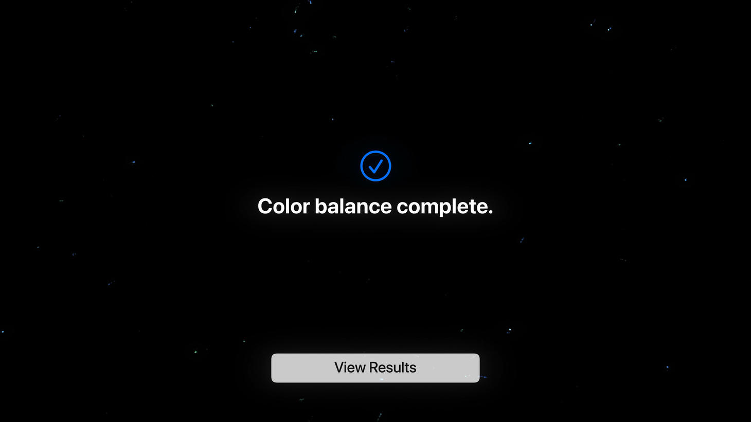
A Headline, Centered
This design says the main takeaway clearly, adds a nice checkmark icon to help, and has a single button. What more do you need? This is a great reminder to make sure our designs say what they are trying to say and make it easy for people to get the main takeaway of any moment.
No-Fuss Navigation
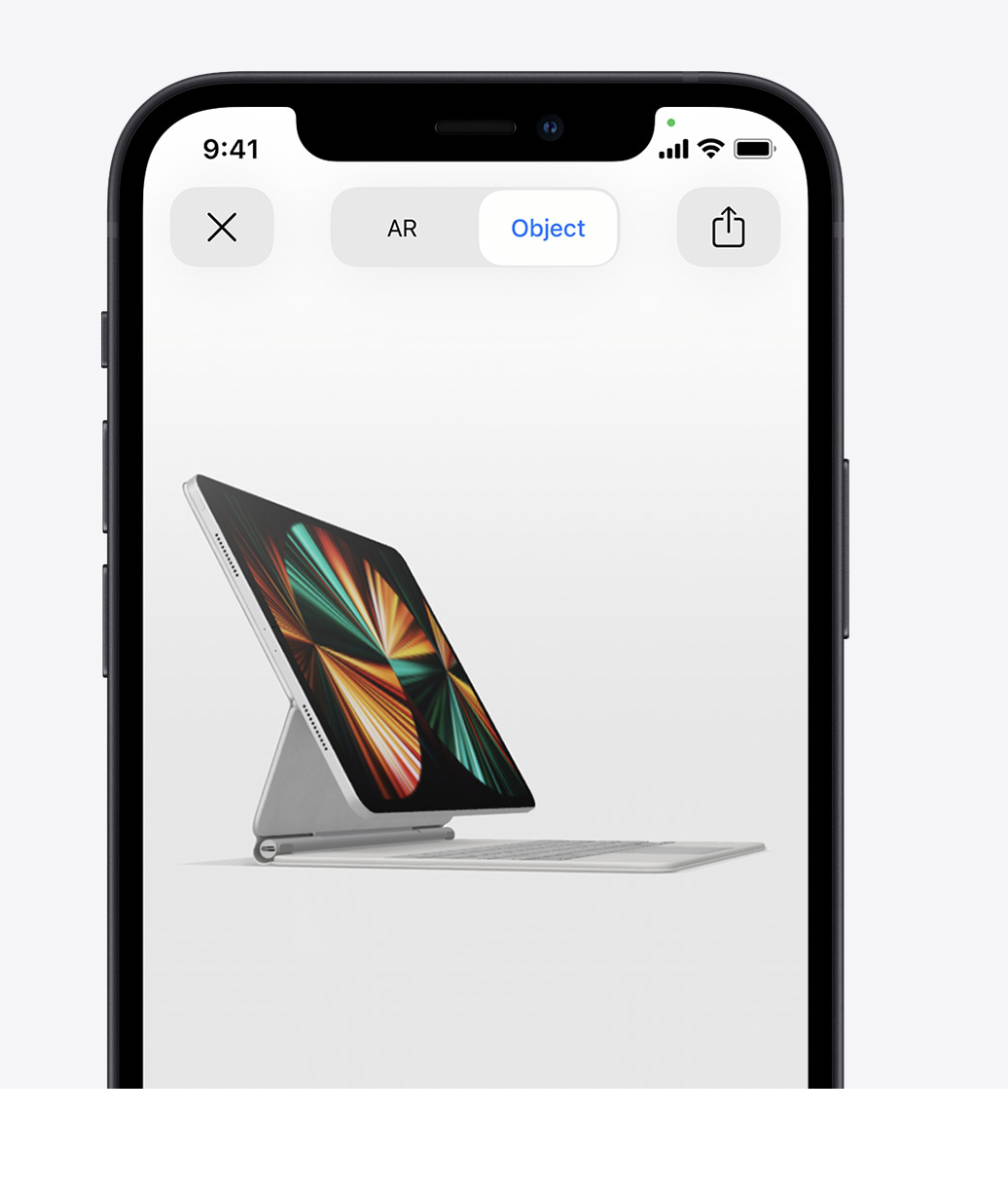
Buttons for exiting, switching modes, and sharing at the top of the AR viewer. You may normally seek out an interesting way to come in and out of modes in your design, like seeing the iPad on your desk versus seeing the iPad as a free-floating object. But, if a lot of people are going to be using this design for just a few seconds and perhaps they're even trying it out for the first time, maybe going with the simplest presentation, like a simple toggle at the top with "AR" and "Object" as the two choices helps the most people use the design and get the most out of it.
