 Note
Note
Nice to see you after everything!
Welcome back to UI Designer Weekly the week of WWDC22! This week, the announcements, the sessions, and design that came from Cupertino were simply amazing. I feel inspired beyond even what I was expecting to feel and I think that just shows you how much work and creativity must have gone into everything that was announced.
So! It's a big year. Lock Screen, Stage Manager, CarPlay, new pickers on iOS, designs changing and staying from iOS 15 to iOS 16... we are going to have plenty to look at for weeks to come. If there is anything specific you want to see covered in UI Designer Weekly, reply to this email and let me know!
If you are planning on going back to the keynote video or spending some time on the new OS pages on Apple's website, I recommend adding these features to your itinerary so you can be up on all the new designs:
iOS 16: Lock Screen, Widgets, Live Activities, CarPlay, Focus Filters, FaceTime, Mail, Home, Spotlight, Maps, Apple Pay orders, Medications, Family Checklist
iPadOS 16: Stage Manager, Weather, Freeform, Game Center, Desktop-class apps
macOS Ventura: Stage Manager, System Settings, Mail, Collaboration, New Share Sheet, Spotlight
watchOS 9: New Notifications animation, Watch Faces, Workout, Health, Home, Calendar
You can also check out Every Moment of Beautiful Design in the WWDC22 Keynote for a long list of moments that together are so beautiful and so inspiring.
I hope you've had an incredible week of inspiration, new thoughts, and excitement for this next year.
Thank you for joining me and happy start of the design summer!
New Standards
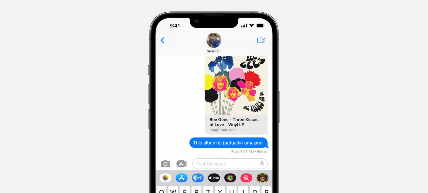
Right on the Dot
Editing a message on iOS 16 adds a small "Edited" subtitle to right of the message's status. A single unicode bullet character (which you can type by pressing ⌥ Option + 8 on your keyboard) separates the standard status from this new "Edited" addition. I think this is a great example that new features we design don't necessarily need entirely new designs to be communicated. We can use established parts of our designs, and even simple arrangements like a single character separator, to add a whole new dimension to our designs.
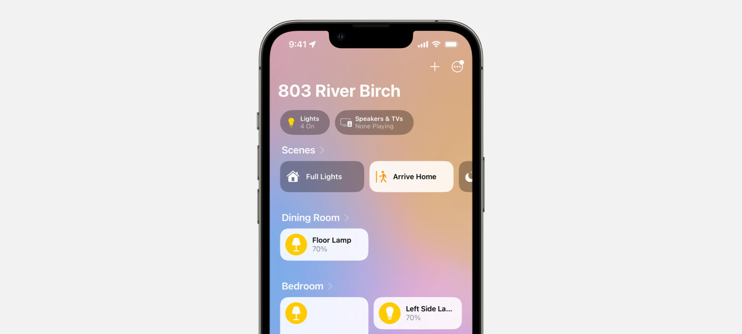
Cleaning Up Around the House
Home on iOS 16 lets you see all the rooms in your house on the first tab, arranged in a scrollable vertical stack. Maybe, if people were spending lots of time swiping between the room screens that were in the previous version of Home, this is a better way to put everything in one quick, easy place. Notice the generous padding above the section titles, and the overall weighting. "Dining Room" is bold and is pretty close to its accessory "Floor Lamp", so it's easy to see which accessories belong to which room on this page, even though it could grow to show lots and lots of accessories.
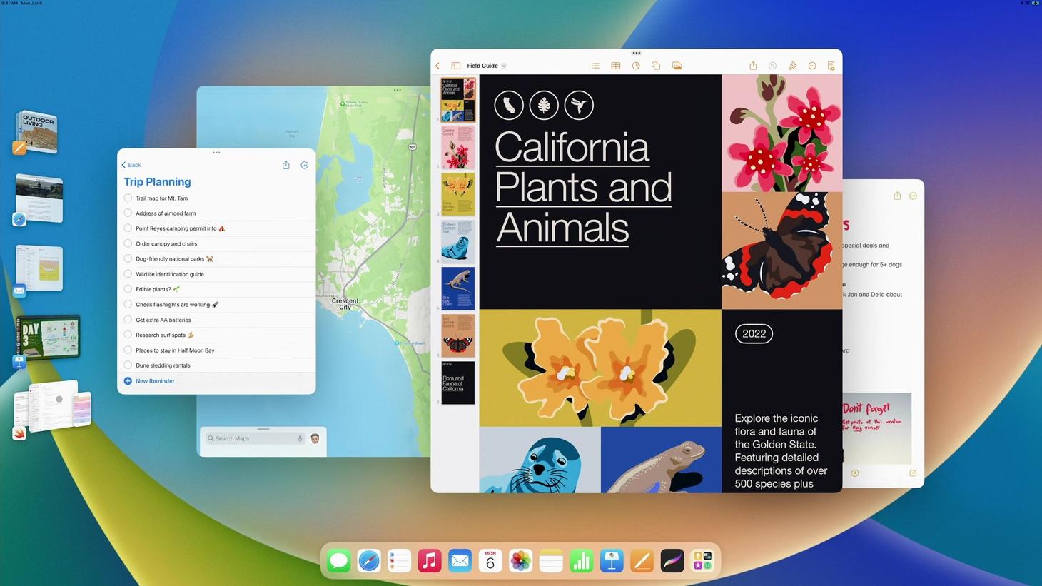
Everything I Ever Dreamed Of
Awe is what I am in when I look at and use Stage Manager on iPadOS 16. This design looks like the concepts of futuristic interfaces and yet it is here today. I think this design is a great reminder that we can focus on the interactions in our designs, how people get around with the designs we make, what they actually tap on or click on, what happens when they do, and so on to make our designs better. Here, visually, the Dock looks perfectly familiar. Even the windows in the middle of the screen look the same as they normally would. It's how they are and what they do that's completely new. The smart sizes the windows snap between helps people efficiently make the window change they want to make, and a new floating gravity helps you switch the positions of two windows and have them balance out like there's an alignment grid underlying all nature. Then, in the coolest move of all time, thumbnails of your staged windows are still always visible on the left. You see the app icon, the window as you left it, and if you tap on one, that window rotates in smoothly and beautifully, while what you had goes back out to the left. You discover how Stage Manager works and can easily undo what you did simply by tapping back on the pile of windows that just rotated out. This is also a great example of how we can make our designs safe, so people can easily tap around without accidentally deleting, closing, or removing something unintentionally that they can't get back. Bravo, Apple.
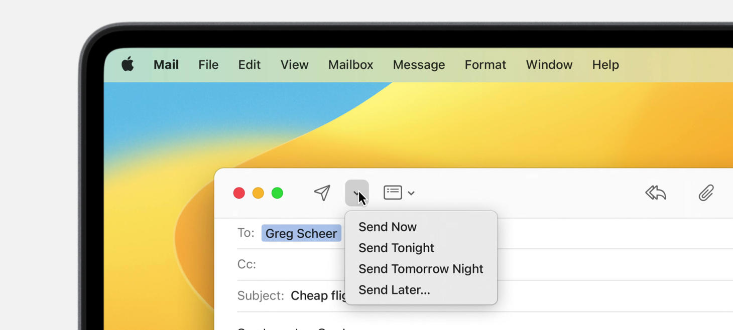
Sending Love Letters
A beautiful new menu in macOS Ventura that represents a win for menus everywhere. Each menu item starts with the "Send" verb and then the time you'd be sending your email by. I think this is a great example of a menu that is compact and in a great position. It's right next to the send button, and there are no menu items in the list outside of the "Send" ones. Maybe that helps people know exactly what the menu is about as soon as they open it, instead of feeling like they don't fully know what all the items are about and will come back to check it out later. This WWDC had a great session on UX Writing for more expertise on writing great interface elements like these.
Design of the Week
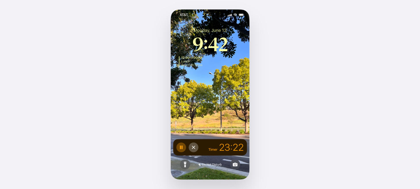
iOS 16 Timer Live Activity
Take this week’s conversation with you and try changing up this week’s design. You can download this design free as a SwiftUI design file and open it up on your iPhone, iPad, or Mac with DetailsPro.

