 Note
Note
Welcome back to UI Designer Weekly!
Just yesterday, macOS Big Sur was made available to everyone around the globe. Over the next few weeks, and I'm sure even longer than that, we are going to unpack the details of the updated design language. We are going to discuss everything from the smallest changes in padding to the biggest changes that have come from design achievements on iOS.
I planned to spend the week working on different projects but ended up spending most of the week fixing some issues with the design app that I make, DetailsPro. iOS 14.2 had introduced a few changes that were making major parts of the app act funny. Luckily, I was able to sort this stuff out and get an update out to designers.
I hope you enjoy the beginnings of our macOS Big Sur coverage and are settling in for a relaxing weekend.
Sahand
New Standards

Title Strong
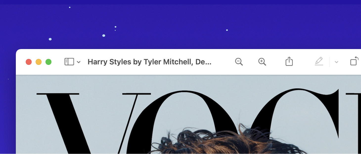
macOS Big Sur's updated design language has made a change in where a window's title is placed: on the side instead of the in the center.
Seeing a title in a semibold weight on the side is a comfortable, predictable but still why-didn't-I-think-of-that sort of idea. To me, this makes big waves as a fantastic demonstration of how to blend an interface with content.
Left or right justified titles, that feels like something you'd see in a document, in a page, basically something in the "content". And then you'd see the window with a title in the center at the top because that's the window.
Here they feel one and the same. In a way, the interface design of the window itself has given way to a headline placement that can be what the content is currently about. In a news reading app, it can be the title of the story; in a customer records app, it can be the name of the customer. macOS Big Sur is serving us up a challenge to marry our content with our design in ways that get people right to what they want.

Would You Like to See the Menu (Bar)?
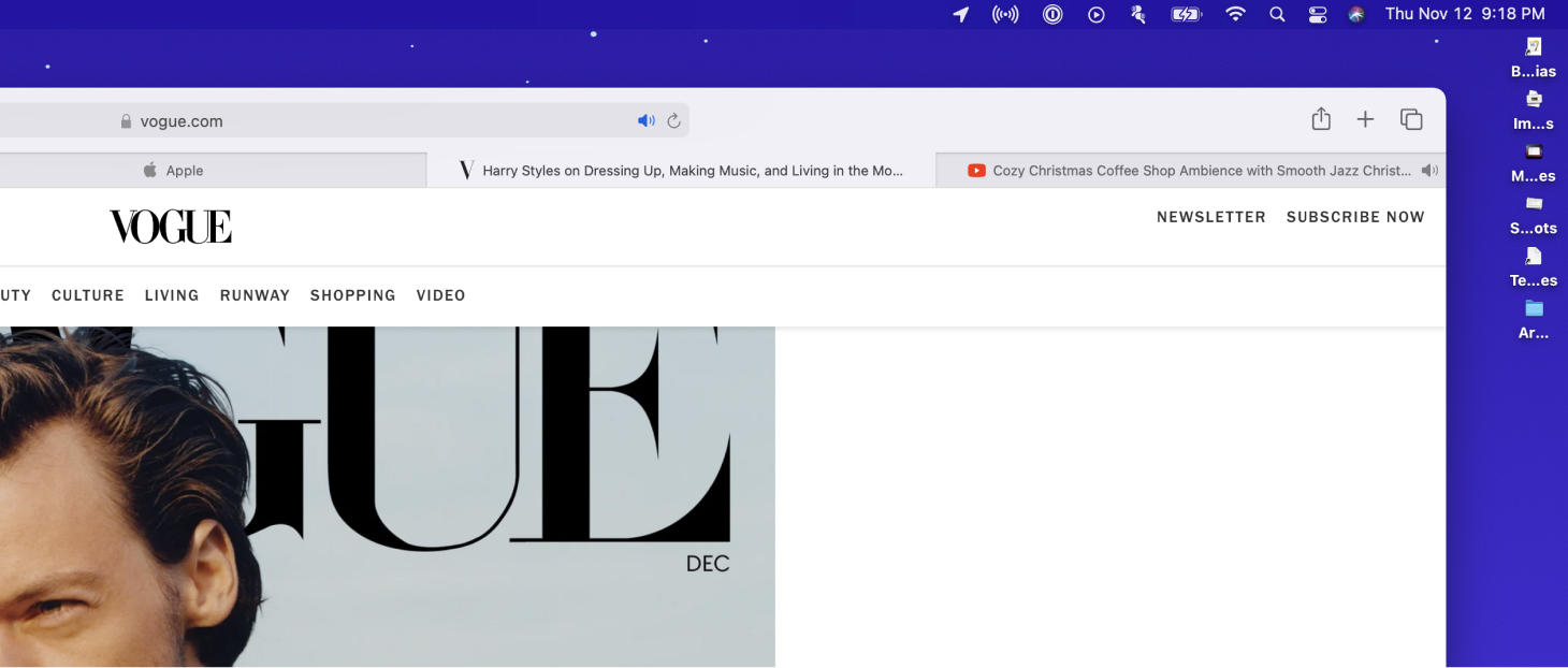
Bright, adaptive icons dot the Menu Bar across the top of macOS Big Sur.
When you see a "macOS Concept Design" on the internet, you often see one with a fully transparent menu bar. It's true that when you look at any design that you seek to reinvent, it's a productive practice to simply start removing major elements to then observe any new effects. But, alas, in macOS Big Sur the menu bar is still not fully transparent. This is certainly because, while that visual appears to be a killer way to fast-forward to the future in many concepts, it doesn't deliver the clarity and ease-of-use that the menu bar needs when it could be sitting on top of busy wallpapers.
I think there's a lot we can learn from this. There is the simple idea that we must push our visual designs to be as aesthetically beautiful as they can be, given that they are still usable. That an extreme beauty does not provide in itself any ease of use or usability. There's an element of the "pick your battles" kind of thinking. Make the biggest changes in your designs where they will make the greatest impact.
Will many new Mac customers notice a fully transparent menu bar? Especially in contrast to the maybe 10% or 20% menu bar that is in Big Sur now? There are definitely so many other places that time and considered design effort can be spent.
But, I think we do and should keep chasing these things. These ideas live and grow and evolve. A year from now, in UI Designer Weekly, I hope we are all still here having this conversation about design, and checking in on that beloved menu bar.

It's So Quiet Around Here, Without Any Lines
Look around macOS Big Sur and you will find familiar visual elements placed in new, considered, beautiful order.
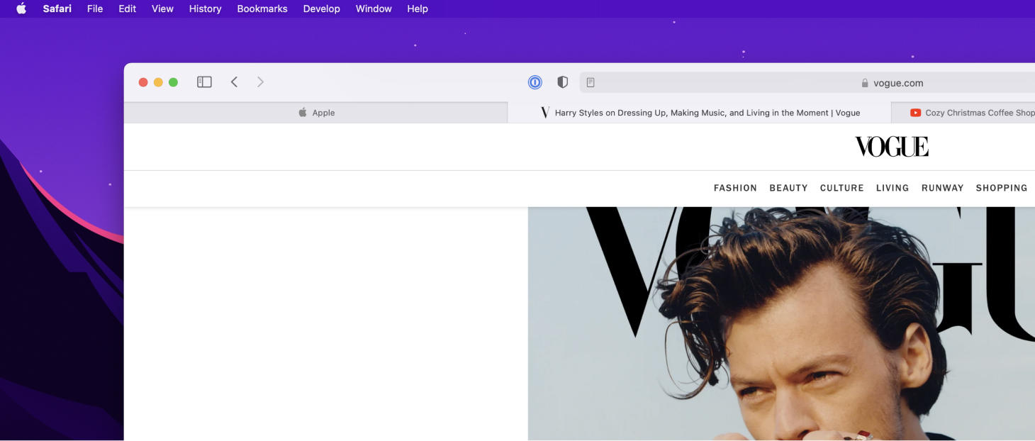
Pictured above, the upper-left corner of Safari exemplifies this updated design language. Between the traffic lights, sidebar, and back/forward controls, there is nothing but space.
On hover, you see a rounded rectangle fill behind each icon. I feel Big Sur sends a message to us designers that is telling us to consider our placements, our paddings, and our proximities between our visual elements more than ever, because these principles have matured quite a bit in screen design to be plenty as the tools we can use to create an interface.
Or, put another way, what makes a button a button has changed with time, but what makes certain elements appear to be related to certain content has not. What makes a visual element's purpose clear and simple to understand has remained the same.
