 Note
Note
Welcome back to UI Designer Weekly!
Hello! I've tried something new this week by adding the Video Edition of UI Designer Weekly. Now, each week, there will be a short video accompanying each issue where I scroll the issue and add commentary, background, and give you what I thought were the most important things that came with each design example.
Watch The Video Edition, Issue 8 here. I'm also going to add video editions going backwards to the very first issue.
You can watch The Video Edition, Issue 7 for last week here.
I hope you enjoy the added video experience and have an inspired week!
New Standards
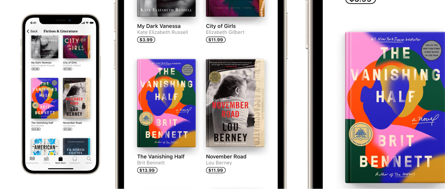
Both Playful Design and Visual Magic
Books has this magical touch where each book cover has what looks like a true spine with a crease in it. All from a combination of dark and light gradients! This is a reminder to have fun and to find those parts of your design where you can spend a little extra time and take a few more risks to see if you can really elevate that part.
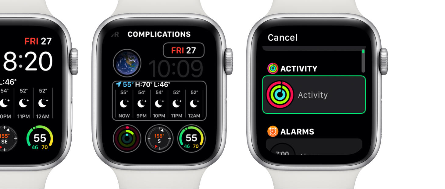
A Roomy Redesign for Complications
A simpler, roomier complication picker in watchOS. Now, you tap on a complication and are taken to a roomy that has each complication choice displayed with more accompanying information (Before, this all happened in-place on the watch face itself, which, while definitely clever, left little room for any other visual elements to aid the interaction). This is right inline with what we went over last issue with Control Center on macOS Big Sur and the customization for that in System Preferences: When is a design element basically at its limit for how special and unique it's available interactions should be? When do you add another layer of interaction on top, and when do you decide to create some space and move more of it to a different, simpler, broken-out area?
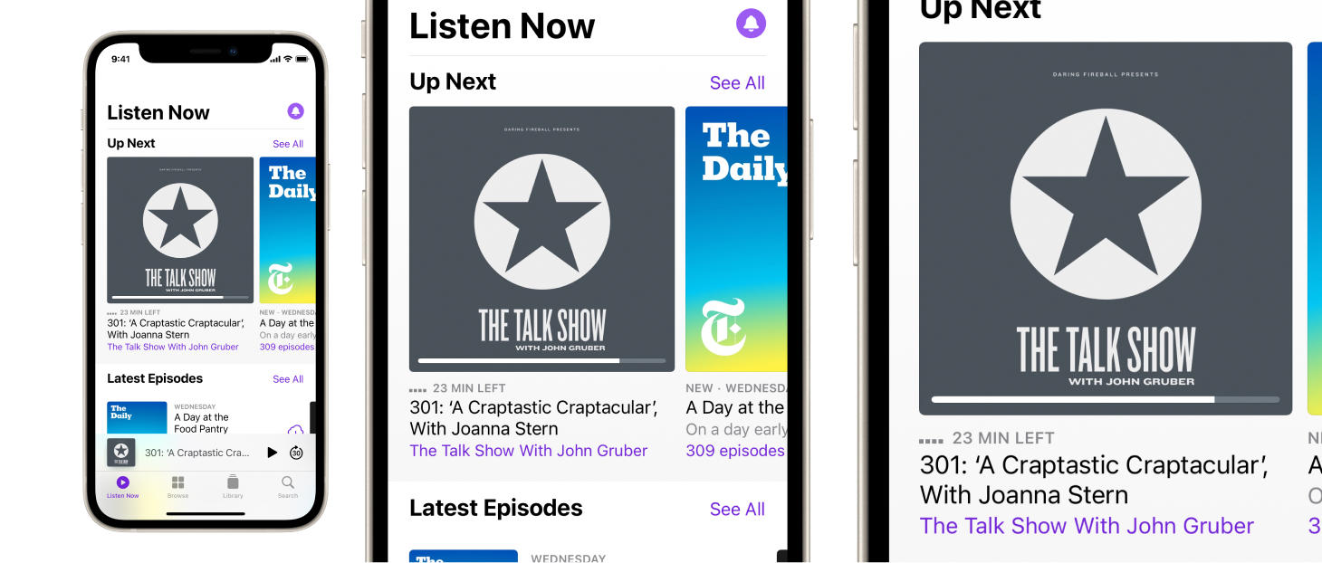
It Takes Two (Visual Elements) to Tango
A progress bar and a text element display the time remaining in two different ways in Podcasts. This is a simple reminder that we don't have to reduce any bit of information in our designs to one and only one visual representation. Perhaps, if we have two, and we can keep them balanced in our designs, we should. We can also notice there that the progress bar is placed directly on top of the episode cover, so it's not even that the multiple representations of the same information need to be inline with each other. You can also think about this as another example of "information at a glance" and "information in detail". The progress bar provides "glanceability" compared to the "23 MIN LEFT" text element. Think about places in your designs where maybe you could provide a more glanceable representation of something that people who use your designs would want to know quickly.
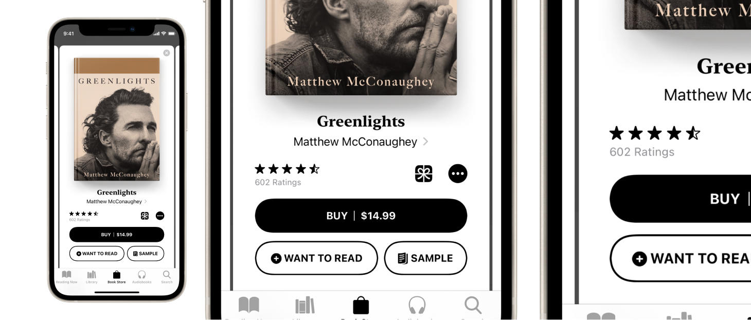
A Clear, Compact Arrangement
A primary button, a couple of secondary buttons, and more tappable, visual elements arranged in Books. This design can serve as a great example for how to handle when you need to put several buttons in one spot in one of your designs (it's standard to make the primary button the one that's filled, and the others outlined; It's standard to place the primary button on top, and make it the largest one). This example truly contains the spectrum of tappable elements: A text element with a chevron on the side, an icon by itself, a "more" menu, and rounded rectangle buttons with text and icons in them. If you find yourself creating a design that is making use of each of these different types of tappable elements all together, you can look at this design for a few good ideas on how to find balance.
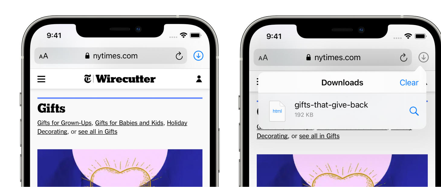
A Familiar Look and Feel for Safari Downloads
Safari on iOS extends the visual language of Safari on Mac by adding the downloads icon into essentially the same space where it is on the Mac. Perhaps you would think this is the obvious choice, looking at it now, but it's not always so clear when you are designing and in the process. Seeing the same icon is one level of familiarity and seeing it in the same place is another on top of that. This is a nice reminder for us to try and seek out the expectations and the context that the people who will use our designs carry with them. I have dealt with the urge to reinvent and be "completely original" in the past, and as I have gained more experience I have come to appreciate the speed and productivity that people can harness when a design is familiar to them.
(Truth be told, a few years ago I was basically yelling at the Sun, trying to come up with something new to replace the tab bar at the bottom of apps. I was imagining all these new interfaces with pop ups and floating buttons. Nowadays, truly, I look at that thing and I think "Wow. That is basically a wormhole for people to zoom to different places in an app in just a single tap. How useful."
This icon also oozes the modern spacing, weight, and colors that we see throughout the OS's design language. Looks pretty beautiful for just being an icon next to an address bar.